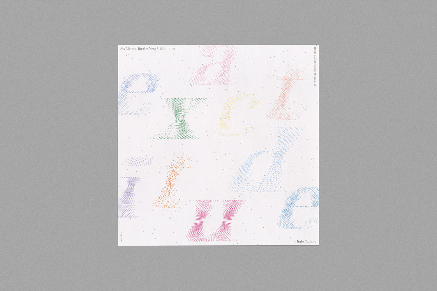
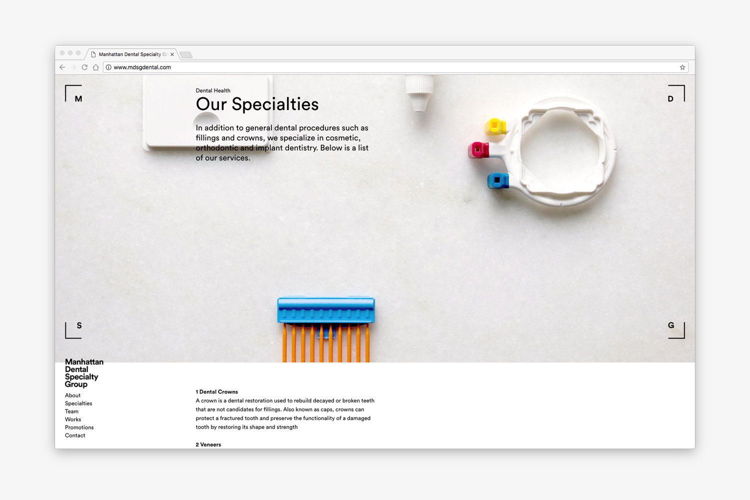
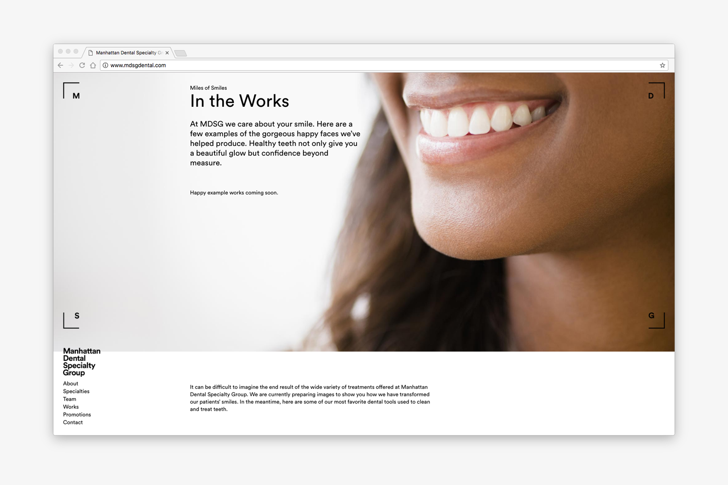
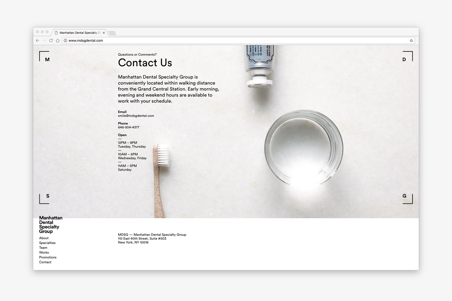
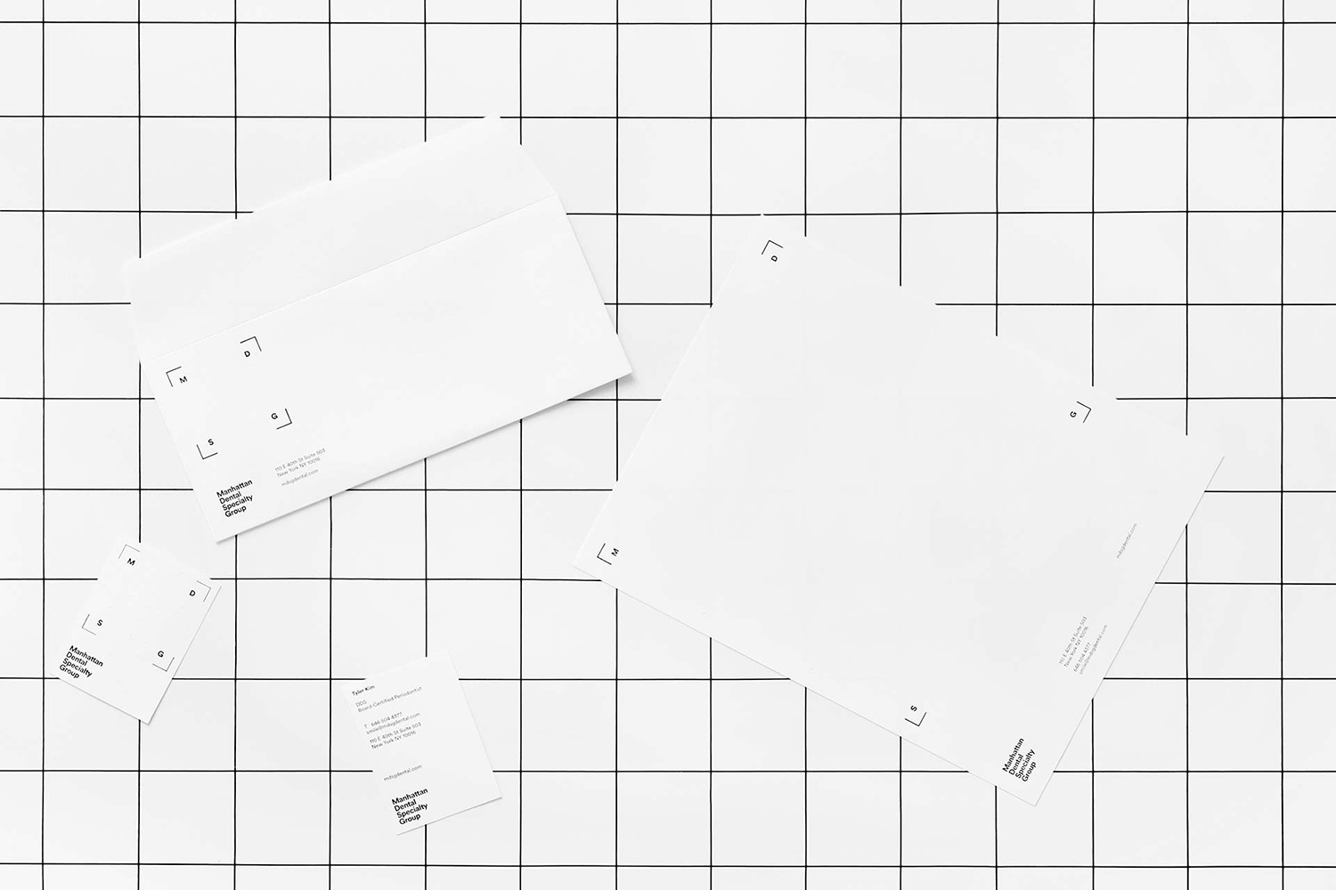
Title
Duration
Category
Location
Superegg is a vegan skincare brand co-founded by Erica Choi of Egg Canvas. Updates on Instagram. Design: Why Not Smile. See more here.
Critical Landscapes Lab looks at socio-ecological issues in postcolonial Islamic cultures through study of landscape architecture. Research in affiliation with the Aga Khan Program for Islamic Architecture at the Harvard GSD. Design: Why Not Smile. See more here.
Select artwork from Valerie James that capture moments of transition. See more here.
Studies on perspective, from the Latin word perspicere, which means to see through. Observations center on positioning and framing of poster formats ubiquitous to graphic design. See more here.
A landscape that replaces text as newspaper content. Sign up to receive emails at Let’s Meet Over There. See more here.
A set of thirty-six prints. Each historical scene on the left, corresponds to another of Providence, Rhode Island on the right.
A sound installation that simulates a phone conversation with sparrows. Callers can dial 401-601-1996 and listen to recordings of local species found in Providence, Rhode Island. See more here.
An installation of words that are tied to helium balloons and suspended midair. Set in various weights of Univers – notable for its range of letter widths – lighter words float and heavier words weigh the balloons down. See more here.
Programming for a music box that translates the term common ground. Made in the spirit of Mono-ha that serves observation over comprehension. Words from Martin Luther King Jr.’s I Have a Dream speech. See more here.
let freedom ring


A series of twenty-six letters to Amy, who gave me a bobby pin for blonde hair. I wrote her twenty-six black letters in return, made by scanning my own black bobby pin. All letters were written in a gift exchange workshop with Paul Sahre. See more here.
The Automatic Ice Melting Machine (AIMM) melts ice at room temperature. AIMM can adjust its settings to any hot/cold environment and works without human assistance. Made in an automation workshop with Eroon Kang.
A lecture poster for E Roon Kang with graphics that reference his work, Additive White.
An incomplete list made in TextEdit beginning with #11 Celebrate the Incomplete. Based on the artwork How to Work Better by artists Peter Fischli and David Weiss. Photo credit: Why Not Smile. See more here.
Letters made by subtracting shapes from a pattern – adding parts first and then editing the whole – as if writing a composition or carving a sculpture. See more here.
An invitation to join at the Cathedral and wait for the silence that comes after the church bells. See more here.
6pm bells


Some posters made at the Nature Lab while working there as a graduate assistant.
An article about the Nature Lab with interviews about its history and vision for programming in the space. Birds, Bees, and Beyond was included in RISD’s annual publication V.1 and was written while working there as a graduate assistant. Design: Angela Lorenzo. See more here.
An identity that reflects Urbino’s rolling hills and the city’s quirky air of being both past and present. Urbino is a Unesco World Heritage site well-known for its renaissance architecture. See more here.
I became friends with the landscape of Urbino, as attempts to make people friends were unsuccessful. New friends include several italian cats, a green chair, some small pigeons, a rainbow, church bells, a family of cicadas, and the rain. Also, some postcards made for my friends in Urbino. An attempt to extend our companionship. See more here.
A typographic study on exactitude from Italo Calvino’s “Six Memos for the Next Millennium.” Calvino describes exactitude as giving “extremely precise and careful attention to the composition… in order to achieve the desired vagueness,” arriving at the conclusion that “the poet of vagueness can only be the poet of precision.” See more here.
Silkscreen prints of a flat circle transforming into a sphere. See more here.
Jars of laughter from around the world. Each recording comes with an interview about the its cultural background and humor code. See more here.
Sample 1


An object that expands wonder in literal and figurative ways.
A poster about the Bauhaus, short essay included.
Soft objects made from lines of yarn, woven as flat surfaces and then folded into unexpected shapes. Each bundle exhibits new color combinations by folding and rolling. See more here.
Too Cool For School is a beauty brand that supports artists through sponsorships, collaborations, and residences. Its website exhibits a Collaborative Abstract Painting in the same spirit. Design direction: Why Not Smile
Les Clefs is an exclusive social gathering. Its symbol is a manor house typical of those in Le Marais – a reference to historic French salons where select intellectuals met to exchange knowledge and refine cultural taste. Design direction, photo credit: Why Not Smile. See more here.
MDSG is short for Manhattan Dental Specialty Group. A set of four corners on versatile grid illustrates the profession of aligning teeth. Design direction: Why Not Smile. See more here.
AP&P is short for Advanced Prosthodontics and Periodontics. Straight lines illustrate the profession of aligning teeth. Design direction: Why Not Smile. See more here.
Harvard GSD’s Wheelwright Prize is an international competition that awards $100,000annually to support early-career architects and their proposed research. Design direction: Why Not Smile. See more here.
Dr.Jart is a skincare brand that promotes science and art as a means to health and beauty. K-Beauty Innovation exhibition space. Design direction: Why Not Smile. See more here.
Dr.Jart is a skincare brand that promotes science and art as a means to health and beauty. Promotional material for new items. Design direction: Why Not Smile. See more here.
Dr.Jart is a skincare brand that promotes science and art as a means to health and beauty. Website and newsletter. Design direction: Why Not Smile. See more here.
A Sustainable Future for Exuma is a research project organized by the Harvard GSD. Each dot in Pin represents an island of Exuma. Design direction: Why Not Smile. See more here.
Crystal One is a conglomeration of different companies that promote cultural exchange, including Crystal Wine. An upside-down triangle is the logomark, a metaphor for gathering in the presence of good wine. Design direction: Why Not Smile. See more here.
The Journal of Biological Chemistry is a weekly peer-reviewed publication. Geometric shapes on the cover illustrate the chemical structure of EGCG featured in this edition’s main article.
Eury Kim © 2020